In the world of data science, dashboards are more than just collections of charts and graphs; they are narratives told in numbers, insights crafted from information. During my tenure at dPO Technologies, I’ve had the opportunity to craft these narratives, guiding decision-making processes and steering business strategy through the turbulent seas of data.
The Pulse of Performance: Executive Dashboards
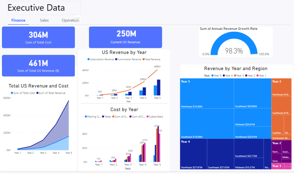
Our executive dashboard didn’t just report numbers; it provided a panoramic view of our organization’s financial heartbeat. It spotlighted the synthesis of total costs against US revenue, painting a clear picture of financial health. We tracked the upward trajectory of subscription revenues, juxtaposed with operational costs, to inform strategic adjustments and investment focus.
One of the key highlights of this dashboard was the ‘Annual Revenue Growth Rate’ indicator. It wasn’t just a number—it was a testament to our strategic initiatives and market responsiveness. A growth rate of 98.3% over a fiscal year was more than a metric; it was a milestone that celebrated our team’s collective effort.
In-depth Analysis: Sales and Operations Insights
In Sales, our dashboards did more than just account for subscription revenues; they delved into the nuances of churn rates and subscriber growth, serving as an early-warning system for customer retention strategies. They helped us understand the narrative behind each cancellation, and each sign-up, to better tailor our customer engagement efforts.
For Operations, the dashboards served as a strategic lens, focusing on occupancy rates and revenue breakdowns by region. The ability to dissect data by geographical sectors enabled us to tailor our marketing and operational efforts to areas of high yield, and to bolster efforts in regions with latent potential.
A Deep Dive into Metrics: Financial Acumen
Understanding the cost of acquiring a customer (CAC) and the average revenue per account (ARPA) is crucial in the SaaS industry. Our financial dashboards not only tracked these metrics but also displayed their interplay over time. We could see the investment in customer acquisition paying off as ARPA increased, underscoring the value of our customer-centric approach.
The dashboards also revealed a nuanced view of our working capital ratio and monthly recurring revenue (MRR), ensuring that financial planning was grounded in solid, actionable data.
The Operational Engine: User Engagement and Retention
On the operational side, the dashboards were crafted to reflect user engagement metrics that are vital to the growth of any tech company. Page views, bounce rates, user retention, and session duration were not just metrics; they were chapters in our story of user experience and interface optimization.
Crafting the Future with Data
My journey with dPO Technologies has been an exciting narrative of growth, challenges, and insights. As I look to bring this expertise and storytelling ability to my future endeavors, I know that the dashboards I’ve crafted will continue to serve as compasses for strategic navigation in the vast ocean of data.

Leave a comment