Category: visualization
-
Optimizing Medallion Architecture in Microsoft Fabric: How to Determine the Ideal Number of Workspaces
When designing a robust data architecture within Microsoft Fabric, one of the most crucial decisions you’ll face is determining the right number of workspaces for your medallion architecture. This choice can significantly impact your data’s security, performance, and governance, making it essential to get it right. In this blog post, I’ll explore the key factors…
-
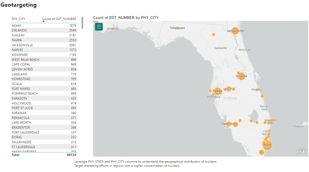
Unveiling the Power of Marketing Analytics Through Dashboards
At dPO Technologies, my role as a data scientist transcended traditional analysis; it involved creating visual narratives that informed our marketing strategies. The suite of marketing dashboards I designed served as a compass, guiding us through the complex terrain of data-driven decision-making in the dynamic world of trucking operations in Florida. Geotargeting and Carrier Operation…
-
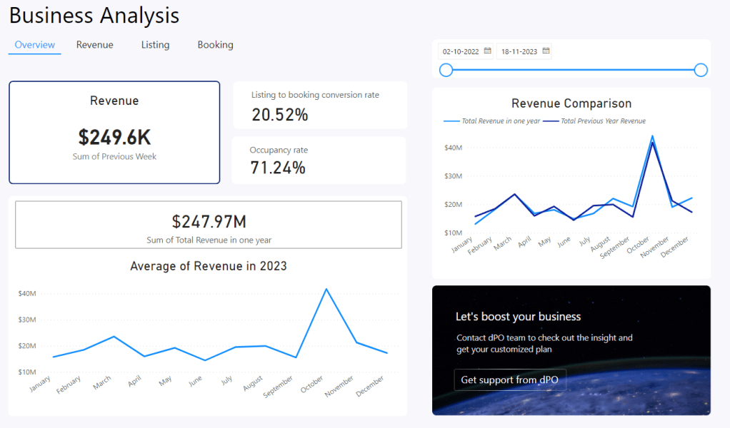
The Art of Data Storytelling: User Dashboard Creations
In the digital age, data is omnipresent and omnipotent, shaping the way we understand and interact with the world around us. My role as a Data Scientist at dPO Technologies has been to make sense of this data, to tell its story in a way that is both insightful and actionable. Through the creation of…
-
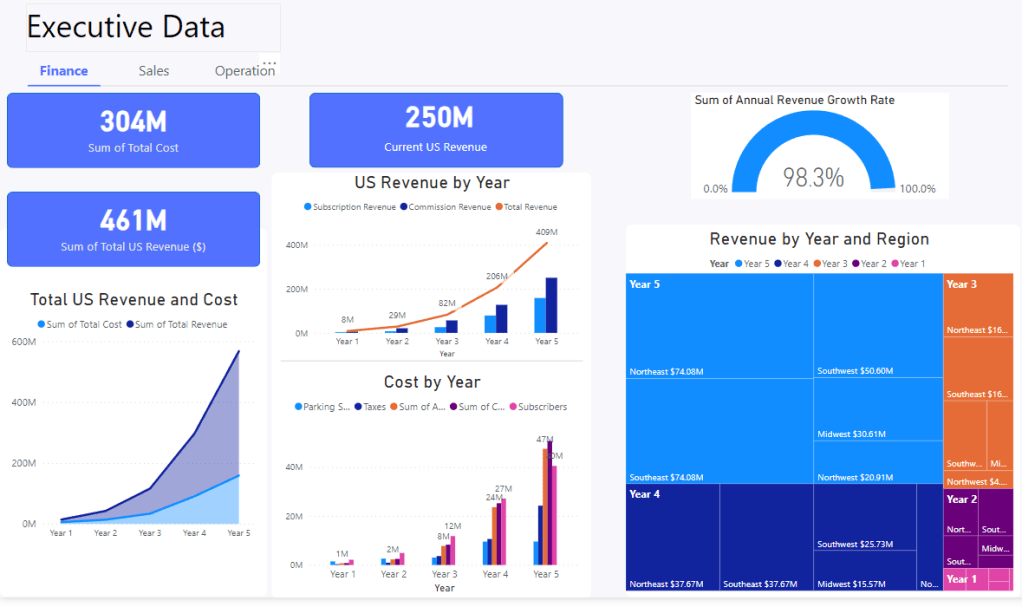
Navigating the Data Landscape: Insights for Executives
In the world of data science, dashboards are more than just collections of charts and graphs; they are narratives told in numbers, insights crafted from information. During my tenure at dPO Technologies, I’ve had the opportunity to craft these narratives, guiding decision-making processes and steering business strategy through the turbulent seas of data. The Pulse…
